Friday 1st May 2026
A significant moment in the visual evolution of Lodge St. Olaf came with the Lodge renovation project of 2005. As part of these improvements, a striking stained glass window was installed in the west wall of the temple. This addition was more than an architectural enhancement—it introduced a new artistic interpretation of the Lodge’s identity, capturing light, colour, and symbolism in a way that brought renewed depth to its visual presence.
The design of this stained glass feature proved so distinctive and meaningful that it was soon adapted into an updated version of the Lodge logo. While retaining the essence of the original Viking imagery, this refined design incorporated elements inspired by the craftsmanship and composition of the window itself, resulting in a more detailed and visually rich emblem. It marked a natural progression rather than a departure—honouring tradition while embracing a fresh and more contemporary aesthetic.
Over the following two decades, this updated logo was adopted widely across Lodge materials and communications. It appeared on official documents, event promotions, regalia, and digital platforms, becoming firmly established as the Lodge’s primary visual identity. Its versatility allowed it to be used effectively across both print and digital formats, ensuring consistency while reflecting the Lodge’s ongoing development.
During this same period, the Lodge website underwent several updates and redesigns, each reflecting advances in technology and changing expectations for online presence. Throughout these changes, the updated logo remained a constant and prominent feature—serving as a visual anchor that connected each new iteration of the site back to the Lodge’s heritage.
Together, the stained glass window and the logo it inspired represent an important chapter in the Lodge’s story—one where tradition, craftsmanship, and modernisation came together to shape a lasting and recognisable identity.
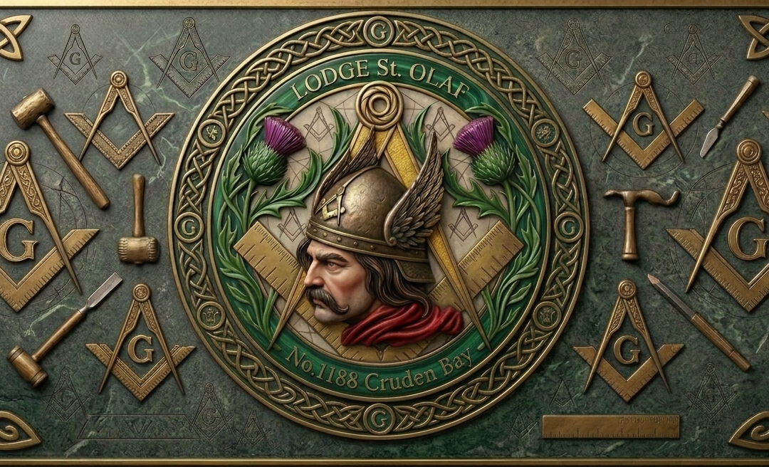
The most recent evolution of the Viking emblem marks another step forward in the visual journey of Lodge St. Olaf. This latest incarnation has been thoughtfully developed to reflect both the heritage of the Lodge and the expectations of a modern audience, combining familiar elements with a cleaner, more refined presentation.
While the core symbolism of the Viking identity remains intact, this new version introduces a far greater level of detail and depth, utilising a richly rendered, three-dimensional style. The enhanced textures, lighting, and layered composition give the emblem a sense of realism and presence that was not achievable in earlier, flatter designs. This approach allows the logo to stand out more effectively on digital platforms, where high-resolution screens and modern display technologies can fully showcase its intricacy. The 3D effect adds visual impact on websites, social media, and digital publications, drawing the viewer’s eye while maintaining clarity at various scales. It also enables more dynamic applications, such as subtle animation, lighting effects, or interactive elements, ensuring the logo remains versatile and engaging in an increasingly digital-first environment.
This new revision is now in active use and features most prominently throughout the pages of the Lodge’s website, where it serves as the primary visual identifier in an increasingly digital-first environment. Its versatility ensures it performs equally well across screens, print materials, and promotional items, reinforcing a consistent and recognisable brand presence.
Presented below is the principal version of this latest logo revision, representing the current standard for the Lodge’s visual identity and the next chapter in its ongoing development.
Mark 1 logo (circa 1986)
Mark 2 logo (circa 2005)
Mark 3 logo (circa 2026)

Mark 1 Website Banner (circa May 2002)

Mark 2 Website Banner (circa May 2006)

Mark 3 Website Banner (circa May 2026)